
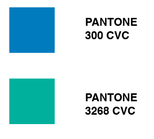
To start with, I did a few logo ideas with the name I had already chosen: ACTIV. I also downloaded the DoH eps logo so I have access to it throughout. I decided to use the colour scheme in the logo, the aqua green and the matte blue - or PANTONE 300 CVC and PANTONE 3268 CVC.
Here are a few quick logo ideas that I came up with. I am planning on settling on one for now and developing it further if I have the time after the content is complete. I think the logo type should be sans-serif and clear, modernised to represent the platform the app will appear on. Here are the initial ideas:

I used a range of typefaces that I thought would fit the bill including DIN, Quicksand, Trade Gothic and Casper. The latter is primarily a typeface for print, demonstrated by the slight indents on the letterforms (top example). I liked the idea of the bar knocked off the A to mimic the V. It represents up and down, relating to machines in the gym such as treadmills and cross trainers. I thought I would finalise this idea now so I have something to work with, otherwise I would be dwelling on it for too long. Here is my final (for now) logo:

No comments:
Post a Comment